The Definitive Handbook For Spotting AI Art
The secret to outsmarting AI is... icebergs?
The Gist
I. Derek Guy and Scott Alexander: I connect Derek Guy’s view of fashion as a social language (history-grounded taste > aesthetics) to Scott Alexander’s AI art Turing test, which shows that people struggle to spot AI art.
II. The iceberg model of art: I introduce the idea that art is like an iceberg—with a visible layer of colors and style and a hidden layer of historical, cultural, and physical truths—and argue that AI art lacks this deeper foundation. It’s just the tip.
III. My handbook for spotting AI art: I explain with several examples that inconsistencies in historical context, physics, or cultural coherence—beyond obvious glitches or lack of quality—allow us to spot AI art.
IV. The future of creativity is ours: I conclude that human creativity will endure. It taps into the whole iceberg, which AI can’t do because it doesn’t respond to the world, it only responds to data—and it surely doesn’t know the human condition.
I. Derek Guy and Scott Alexander
My new favorite online star is Derek Guy. He’s a menswear expert who tweets a lot about fashion. I like to dress well but don’t know how—so that checks out. It also helps that he’s amazing at the quote-dunk game. You better not mess with this Guy. But that’s not why I like him. It’s the way he teaches about clothing.
For him, fashion isn’t just about style or aesthetics but a “kind of social language,” one that’s shaped by history, economics, and culture. He can tell you why a suit’s lapel width varies depending on the decade (as a general rule: the wider the better), how a particular tie knot reflects the politics of its time, or why fabric, color, texture, and silhouette all are more than arbitrary aesthetic considerations but decisions grounded on the particularities of the social world like taste, status, class, and power. He’s always sewing the visible to the invisible.
Which brings us to art—specifically, AI-generated art.
Recently, blogger Scott Alexander ran a Turing Test for AI art, challenging participants to distinguish between human-made art and images created by AI models like MidJourney or Stable Diffusion (for some reason, not DALL-E). The results? A mean and median accuracy of 60%. People failed 40% of the time! Even professional artists didn’t surpass 70% on average. Better than random guessing but not by much. Surely not enough to feel we’re safe from having our culture inadvertently polluted by AI slop.
Scott shared his results and commentary in a follow-up post, with a mix of amusing insights and sharp critiques. For instance, he called Sam Altman “the greatest artist of the 21st century.” For some, it might sound incendiary, but I think it’s the best kind of satire—provocative, ingenious, and honestly, not all that far from the truth if you squint just right. (If you want to understand why he said that, go read the article but only after you’ve finished this one.) He also said this, perhaps more hilarious:
The 1278 people who said they utterly loathed AI art (score of 1 on a 1-5 Likert scale) still preferred AI paintings to humans when they didn't know which were which (the #1 and #2 paintings most often selected as their favorite were still AI, as were 50% of their top ten).
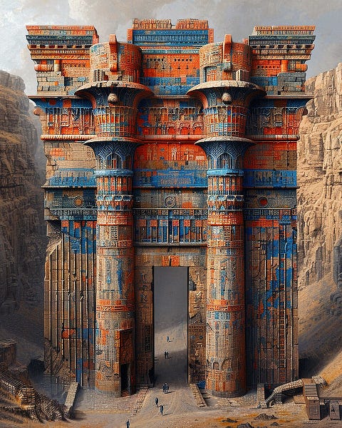
But let’s focus on the worrying fact that people can’t really spot AI images. One of the best observations in Scott’s post came from a friend of his, a digital artist, who reviewed the below image of a ruined gateway, which Scott “especially liked.”
At first glance, it seems intricate and complex, right? She explains why it’s actually super sloppy (I agree):
It has ornaments, sort of, but they don't look like anything, or even a worn-down version of anything. There are matchy disks in the left, center, and right, except they're different sizes, different colors, and have neither "detail which parses as anything" nor stark smoothness. It has stuff that's vaguely evocative of Egyptian paintings if you didn't look carefully at all. The left column has a sort of door with a massive top-of-doorway-thingy over it. Why? Who knows?
So the ornaments don’t resemble any specific style and structural elements look arbitrary, as if the AI had thrown in details for visual flair but without understanding the logic behind them. That’s exactly what happens every time with AI images. That “logic” is always present in human art but never in AI art. It finally clicked for me: art is like an iceberg, and AI art is just the tip.
II. The iceberg model of art
What we notice right away—the colors, brushstrokes, shapes, textures, composition, lighting, and style—is the tip of the artwork’s iceberg. The hidden mass beneath, the part that gives art its physical coherence, cultural weight, and historical grounding is what AI struggles to replicate.
Art, as Derek says about fashion and clothing, has both a visible layer and an invisible one—you can’t separate the two and still expect it to make sense. The hidden layer, though invisible by nature, leaves its mark on the surface, scattering traces, hints, and cues of its presence. This foundation is what anchors art to truth. It’s what connects the map to the territory, what makes some models useful despite all models being wrong. Art is but a map of the reality it aims to portray.
Take a painting of a galleon, like Hendrick Cornelisz Vroom’s English & Dutch Galleons in Combat above. The artist isn’t just capturing the size of the ships and the contrast between sea and sky—he’s embedding centuries of maritime history into the canvas. The shape of the masts, the rigging, the hull design, the cannons—all of these reflect the technological, economic, and even geopolitical forces of the time (look at the flags!). A European galleon from the 1600s looks the way it does because of trade routes, naval warfare, and shipbuilding constraints, not just the artist’s whim.
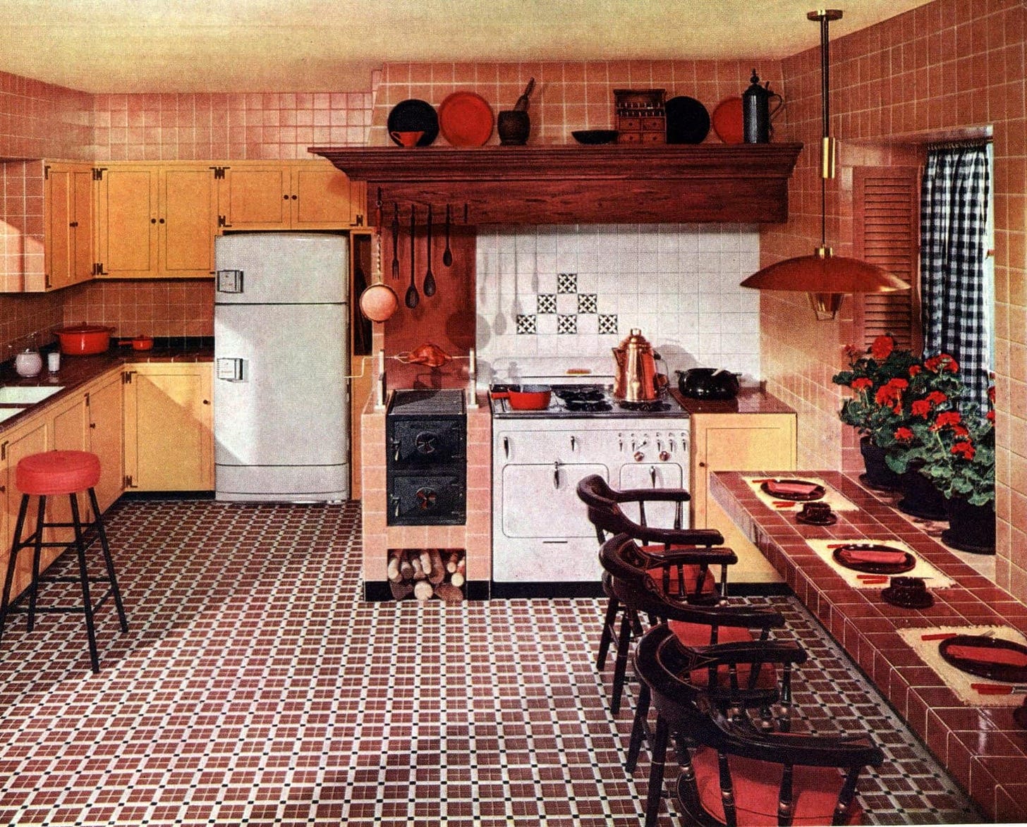
Or consider this depiction of a 1950s suburban kitchen. The patterned tiles, the gingham curtains, the earthy tones mixed with the pastel hues, the red flowers, and the mid-century modern furniture don’t just reflect aesthetic trends—they encapsulate post-war optimism, the rise of consumer culture, and the shift toward nuclear family ideals in Western society. The hidden part of the artwork’s iceberg is about why they existed that way, shaped by economic prosperity, industrial design advancements, and advertising's influence on domestic life.
Human art is not just about stylistic, aesthetic, or decorative choices. Not even just about correctness or beauty. It’s about weaving history into every story, down to the tiniest detail.
Sometimes an artwork defies this notion at first glance—that’s when artists indulge in what they call poetic license (believe me, it’s not just poets). It’s a type of freedom that permits them to diverge from the real and dive into their imagination. It’s Pablo Picasso’s Guernica and Salvador Dalí’s The Persistence of Memory. But the styles—Cubism and Surrealism—belong to the tip of the iceberg. It’s the underlying truth behind whatever is being depicted—the real English-Dutch galleon battle that inspires the painting of a galleon or that type of middle-class suburban kitchen that once populated America or the Bombing of Guernica during the Spanish Civil War—that’s immutable; a feature of history and culture.
Also physics.
We can’t forget that the world is made of things that all respond, obediently, to laws that are written nowhere. Physics governs everything with unwavering consistency. Nothing escapes it, except in dreams. An artist can choose to break the laws—as Picasso and Dalí masterfully did—but they will still adhere to some internal logic—a layer of metaphysical rules also written nowhere but self-consistent. Like physics, metaphysics forms part of the iceberg beneath the visible surface, alongside history, culture, and even politics. You might not be fluent in the metaphysics of cubism or the geopolitics of 1600s Europe and 1950s America, but you know water falls downward and shadows rarely bind. Go from there.
There’s no poetic license at that level anymore, just a truth for the artist to look at and portray as faithfully as possible. AI can’t do that. Because AI doesn’t live in the real world where that kind of truth lives. AI, for all its impressive mimicry, operates on the tip of the iceberg alone. It’s trained on datasets of existing images, so it learns to replicate colors, shapes, and styles. Nothing more.
This isn’t just a quirk of current AI models; it’s a fundamental limitation. You can ask ChatGPT “Why did Picasso go from this in 1897 (as a 13-year-old) to this in 1907, ten years later?” or “Why did Picasso turn a well-drawn bull into an undetailed caricature?” and it would give you an elaborate answer taken from some obscure encyclopedia. But if you asked it to generate an image to replicate Picasso, it’d fail time and again to capture the essence of his story, motivations, influences, goals, and made-up metaphysical laws varying across his art periods.
Let’s return to that ruined gateway. As Scott’s friend says, an AI model can render weathering on stone, intricate carvings, and even believable lighting. But it doesn’t understand why certain arches have specific proportions tied to their function, why decorative elements align with particular construction methods, or how the subtle interplay of stone colors reveals the regional materials or centuries of exposure. Something that can only aspire to be “vaguely evocative of Egyptian paintings” risks sliding down an ahistorical, non-physical slippery slope, ultimately becoming a floating iceberg tip—with no hidden mass to anchor it.
III. My handbook for spotting AI art
Here’s the thing: you don’t need to be an art historian or a physicist to recognize the difference between human-made and AI-generated art. You just need to keep in mind that there’s always more beneath the surface of every human-made art piece that is absent in AI images. I will now show you the how-to.
I came up with the iceberg metaphor because I don’t fully understand why icebergs float—something about density and buoyancy, I think—but I know they have a massive hidden body holding them up. When I look at an image, I don’t try to do color theory or mentally run through a chronological list of stylistic variations through the ages. I simply ask: does this feel like it has a coherent hidden mass made of history, culture, and physics?
Hands and eyes have become well-known stumbling blocks because AI doesn’t understand that it should tie a human body to the evolutive pressures that shaped our anatomy. Those pressures must be implicit in any realistic representation of hands and eyes. This principle applies more broadly: Is this architecture plausible? Do those clothes make sense for the setting and the era? Does that lighting feel consistent with physics? Is there an internal consistency in this abstract painting?
Even if you don’t know the answers to these questions, your intuition can guide you. You don’t need to know every rule of historical coherence; you just need to sense when something’s off, that the tip is floating alone. Most of the time, AI overcompensates or undercompensates for this deficiency. And then, with this framing in mind, you go to the details, to the tiniest, more seemingly irrelevant details. Scott’s friend has an explanation for why this works so well:
Human artists have a secret technique, which is that if they don't know what all the details should be they get vague. And you can tell it's vague and you're not drawn to go "hmm, this looks interesting, oh wait it's terrible".
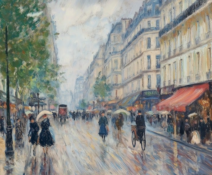
Finally. Let me show you my handbook for spotting AI art in action. I will take two images from Scott’s Turing test (one AI, one human) that earned a special mention, and then I will go through a few more, including some I failed. The first one is an impressionist-like painting generated by Jack Galler—people’s favorite in the entire test. The second one, Mitchell Stuart’s “Victorian Megaship,” was erroneously marked as AI art by 84% of participants.
The only credential I can give you that makes me somewhat appropriate to teach you this is that I scored 86% on the test and got these two images right. That’s why I’m confident this handbook works (at least to some degree). (I have to give credit where credit is due, though: One creator, Jack Galler, fooled me a few times. I want to thank him for being an inspiration for this post and a reason to improve the handbook.)
Keep reading with a 7-day free trial
Subscribe to The Algorithmic Bridge to keep reading this post and get 7 days of free access to the full post archives.


