


Over the years, I’ve shared many charts that illustrate how AI and the industry are evolving. But I’ve never put them together. This is the bigger picture that standalone news articles miss. When you see them at once, things start to make sense.
I’ve compiled 11 charts that I consider extremely important: the ones that reveal the ugly side of the story. A chart tells you what the industry wants you to see. Enough charts, and you start to see through the industry.
The format is: title, chart, one-liner explanation with source. In 5 minutes of reading time, you will understand more about where the AI industry is heading than from hundreds of pages of corporate reports.
Here’s the outline:
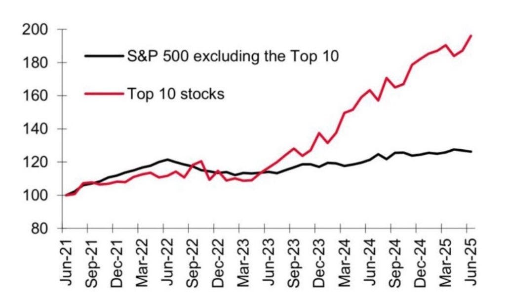
TEN COMPANIES ARE CARRYING THE ENTIRE ECONOMY
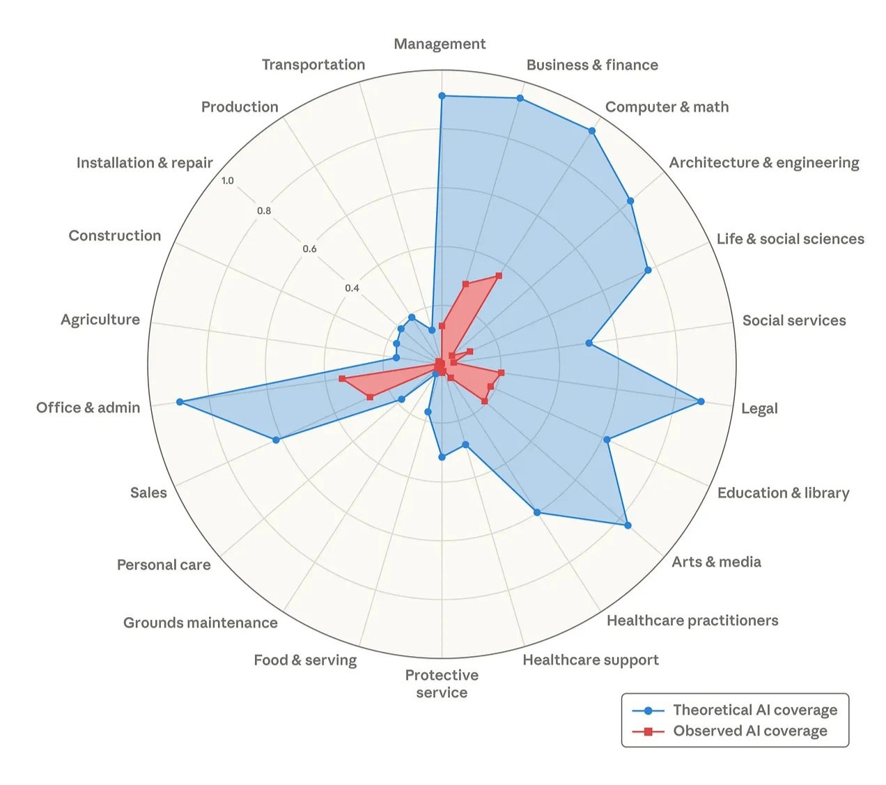
THE CAPABILITIES OF AI HAVE BEEN EXAGGERATED
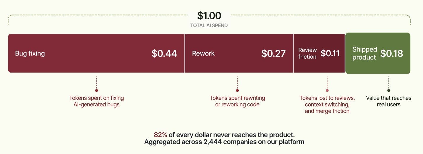
MOST TOKENS GENERATED BY AI ARE WASTED
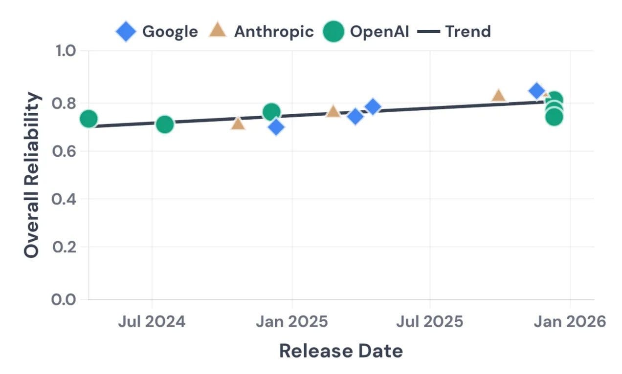
AI RELIABILITY IS BARELY IMPROVING
THE AI INDUSTRY RUNS ON CIRCULAR DEALS
PEOPLE ARE NOT USING AI TO ITS FULL POTENTIAL
AMERICANS DON’T WANT DATACENTERS NEARBY
AI USERS BELIEVE AI EVEN WHEN IT’S WRONG
WORKERS DON’T THINK AI IS SAVING THEM TIME
AI IS KILLING THE JOBS OF JUNIOR DEVELOPERS
THE IMPOSSIBLE MATH OF THE AI BOOM

IMPORTANT REMINDER
I’m running a 50% discount offer on annual subs that ends on June 5th. Get yours now and enjoy the discount forever.
If you read the free edition and have been thinking about subscribing, this is the best time. I won’t do another offer anytime soon.

1. TEN COMPANIES ARE CARRYING THE ECONOMY
2. THE CAPABILITIES OF AI HAVE BEEN EXAGGERATED
3. MOST TOKENS GENERATED BY AI ARE WASTED
4. AI RELIABILITY IS BARELY IMPROVING
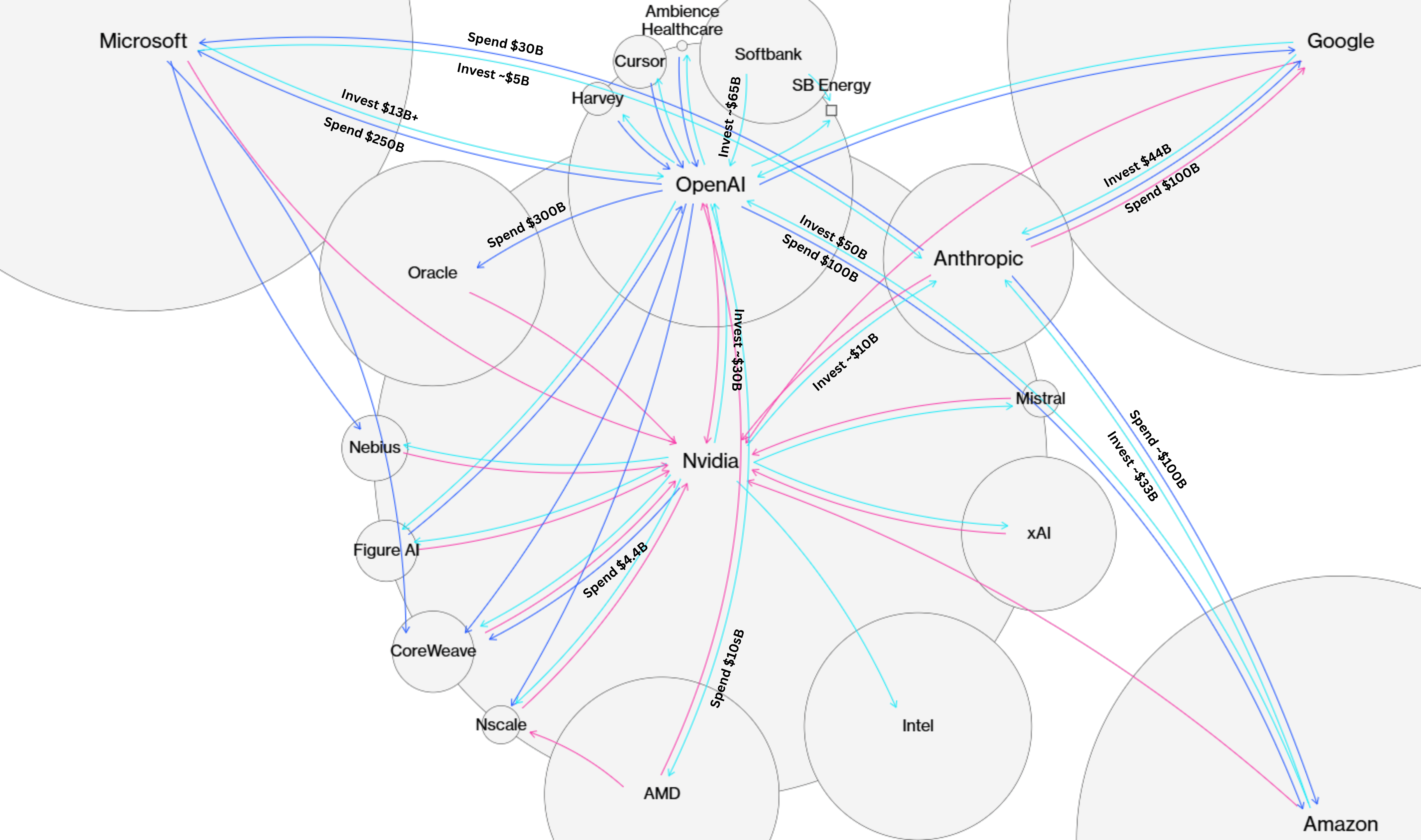
5. THE AI INDUSTRY RUNS ON CIRCULAR DEALS
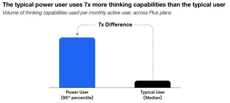
6. PEOPLE ARE NOT USING AI TO ITS FULL POTENTIAL
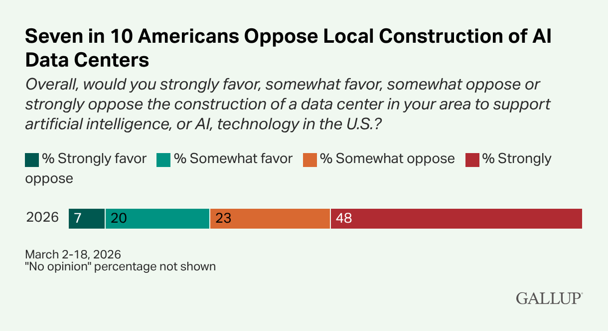
7. AMERICANS DON’T WANT DATACENTERS NEARBY
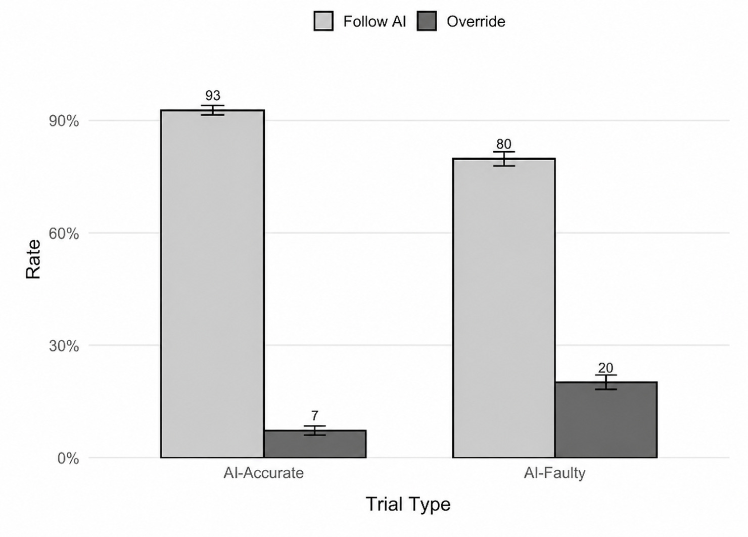
8. AI USERS BELIEVE AI EVEN WHEN IT’S WRONG
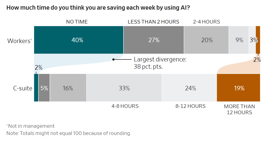
9. WORKERS DON’T THINK AI IS SAVING THEM TIME
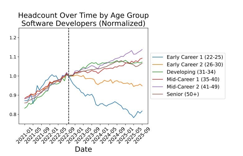
10. AI IS KILLING THE JOBS OF JUNIOR DEVELOPERS
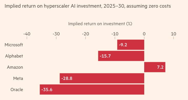
11. THE IMPOSSIBLE MATH OF THE AI BOOM
Alberto: I find your charts fascinating, but I have some questions. (consider that I am 83, an analog grandpa in a digital world.). You mention "right vs. wrong responses." My experience tells me that right and wrong are slippery terms. Some responses, like those in the "real world," are often hard to characterize one way or the other. I don't find all that many purely wrong AI bleats, but when I know something about the subject, I may find them incomplete.
I don't automatically get the distinction between reliability and accuracy.
I also see your distinction between the widespread and the power users. But I wonder whether AI needs many users who are just dabbling. Can it be successful as a technology if it only becomes valuable to "power users?" (One of my favorite movie analogies here is Interstellar, where the true believers had to hide the space program from the common citizenry. The true believers win out, but it is a bittersweet victory.)
Drilling down on that thought, it just occurred to me that military and national security uses may justify a huge amount of AI, whether the average citizen wants or likes it.
Thanks for your work. I had my eyes opened by your earlier piece on public opinion polls about AI. Luckily, I've always been a bit of a contrarian.
Stock prices are not economy-carrying, right? You could say only 10 companies are responsible for the entire stock valuation on SP500, but it's neither fair nor correct to state it's *economy carrying*. Stock market prices tell you only about corporate wealth and future expectations, it's not real economy (employment, production, etc)