
Anthropic’s New AI Report Accidentally Reveals an Industry-Sized Weak Spot
The big gap between what AI "can do" and what people actually use it for


Hey there, I’m Alberto! 👋 Each week, I publish long-form AI analysis covering culture, philosophy, and business for The Algorithmic Bridge. Paid subscribers also get Monday news commentary and Friday how-to guides. I publish occasional extra articles. If you’d like to become a paid subscriber, here’s a button for that:
Today, my schedule says that I should publish a review of the week, but given that the most important event—by far—is still the ongoing feud between Anthropic and the Pentagon, and I’m quite tired of it, I’ve written about something else that I think will be much more relevant in the long-term future: the AI industry is wrong. Again.

I. GOOD NEWS & BAD NEWS
Anthropic released a report yesterday titled “Labor market impacts of AI: A new measure and early evidence.” The authors built a new metric—observed exposure—that combines theoretical LLM capability with real-world usage data to measure which jobs are actually affected by AI.
First things first: the report is careful, methodologically honest, and refreshingly humble about its limitations and the track record of past attempts to predict technological displacement. It contains a chart that tells a far more interesting story than the one Anthropic intended, which I’m going to tell you today. This is the chart:
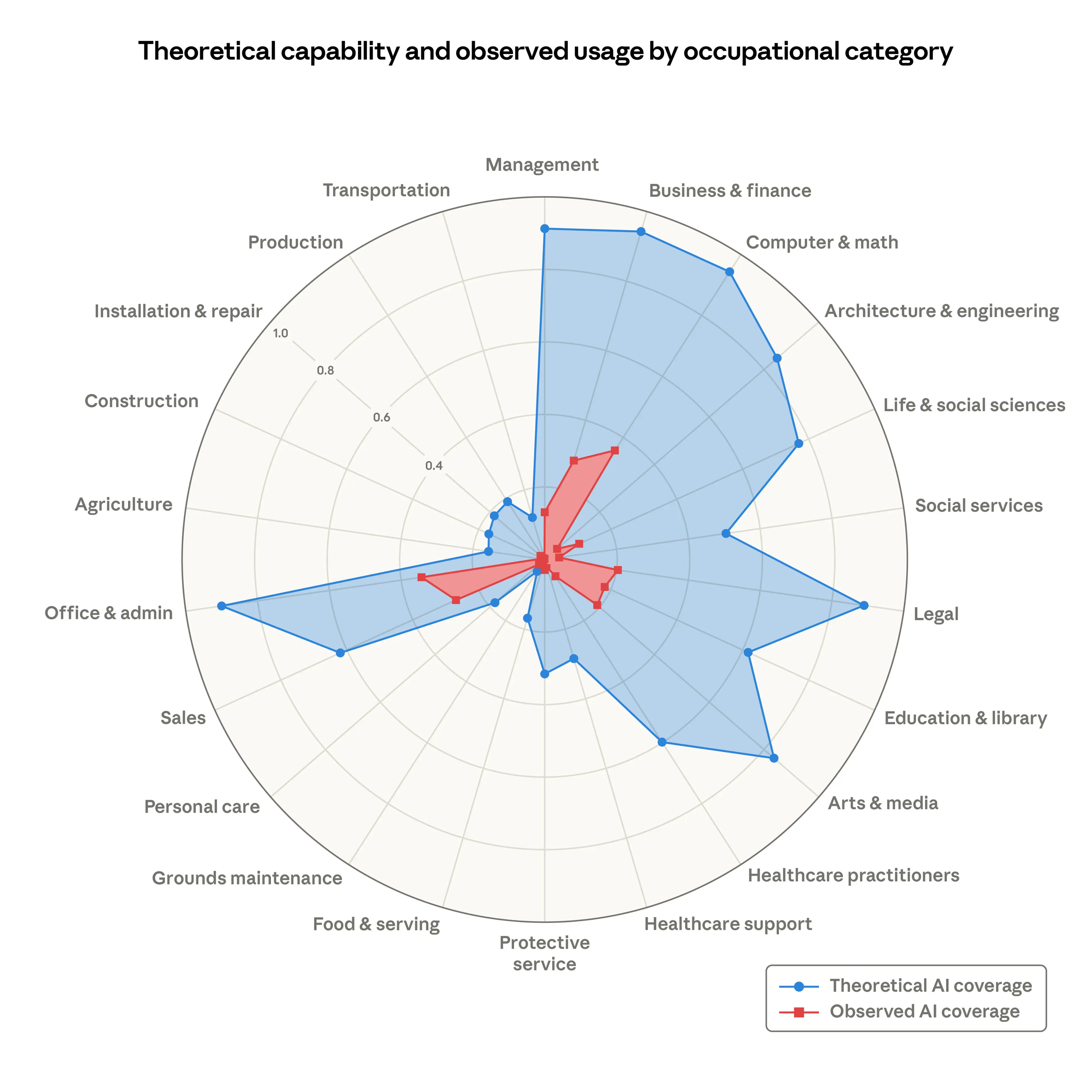
The blue area represents what AI could theoretically do across occupational categories (which tasks an LLM could, in principle, make at least twice as fast, which is quite a narrow metric for “theoretical capability,” but more on this later). The red area represents what AI is actually doing, measured from Anthropic’s own professional setting usage data (from the Anthropic Economic Index).
Look at the difference. In “Computer & Math” occupations, the blue covers 94% of tasks. The red covers 33%. Legal: The blue nears 90%; the red barely crosses 20%. This pattern holds across domains, some more than others: a massive blue area with a tiny red splatter in the middle, like a bruise on a big balloon.
The chart tells two opposing stories, so interpretation is key. Anthropic’s reading of this chart is “look how much room there is to grow.” They write: “As capabilities advance, adoption spreads, and deployment deepens, the red area will grow to cover the blue.” The authors’ interpretation leaves no doubt: the blue area is the future tense of the red area; barely room for a conditional. We just have to wait for the inevitable convergence.
That is both a strict reading of the data and a reasonable expectation. But my reading is different. The gap between the blue and the red can just as well be a diagnosis of AI’s bounds rather than its capabilities. Anthropic is not quite predicting the future, as it is stating a serious chasm between theoretical performance in benchmarks and laboratory tests and actual competence in the real world. They say: Look at how much bigger the red area will be once it covers the blue area and I say: Well, look at how much bigger the blue area still is. They’re handwaving too much the process by which the red area will become as big as the blue—scaling, I assume—asserting that it will.
Same chart, opposite interpretations. So let’s look into it to decide which one is correct. Or at least, evaluate the one they chose to set aside.
II. THE BLUE IS INFLATED
Keep reading with a 7-day free trial
Subscribe to The Algorithmic Bridge to keep reading this post and get 7 days of free access to the full post archives.